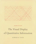
“The Visual Display of Quantitative Information” is Edward Tufte's classic book on the principles behind creating effective data graphics. This is the area where graphic design and statistics meet to present a lot of information in a manner that readily provides viewers valuable insights, without them having to wade through and analyze a swarm of numbers. Charts, graphs and other visualizations of data fall into this category. With the vast amount of data created these days, effective analyses of these data using statistics and digestible presentation of these analyses using graphics become very important.
The book is divided into two parts: the first part gives an overview of the current and historical practice of creating data graphics, while the second provides principles for creating good data graphics. The sample provided in the first part include examples of good data graphics from real publications, including the works of William Playfair and the remarkable flow-map of Charles Joseph Minard showing the disastrous march of Napoleon's army across Russia in 1812, as well as examples of bad data graphics. There is also some analysis of the possible reasons why several reputable publications produce bad data graphics. These reasons include considering statistics as boring for the lay reader, using people with (only) creative arts backgrounds to create data graphics, trying to make graphics look pretty rather than accurate, etc.
The second part of the book presents a theory of data graphics. This includes the definition of terms like “data-ink” (ink directly used to represent data), “chartjunk” (decorative elements of data graphics that do not directly present data) and “data-density” (the amount of data presented per square inch) and principles for creating effective data graphics. These principles include maximization of data-ink, minimization of chartjunk, increasing of data-density, etc. Once again there are several examples from real publications presented to illustrate these principles.
The central idea of the book is to show how to achieve graphical excellence:
“Graphical excellence is that which gives to the viewer the greatest number of ideas in the shortest time with the least ink in the smallest space.”
This leads to a minimal, straightforward and data-intense style that might not go down well with some people (just like the prose of Ernst Hemingway). It nevertheless forces you to think about a subject that is usually considered as just putting a pretty picture instead of lots of numbers in order to not intimidate viewers.
The great thing about this book is that it practises what it preaches - the chapters of the book are short and to the point and the text is lucid. The book itself is relatively slim at about 200 pages of richly-illustrated and nicely-typeset text printed on non-glossy paper. (The author co-designed and self-published the book because he was dissatisfied with the approach of traditional publishers.)
There is a brochure that comes with the book promoting all the works of Edward Tufte, including other books, posters, classes, sculptures, etc. One quibble I have with this brochure is that it was not at all clear to me how his books are different from each other going just by the blurb presented here for each one. This was a little ironical accompanying a book that promotes clear and concise communication.
Almost all of us, at some point or the other, need to present data to others using graphics. This is not the book for you if you are looking for instructions on which type of graphic to use for presenting a given type of data. Once you have picked the graphic though, the principles presented in this book can help you maximize the effect of such graphics in clearly communicating your ideas to your target viewers.
